


It’s one of the most common questions I get from my clients: “What are the best color schemes for Spring family photos?”
While I’m always here to make suggestions, the “best” shades depend on your personal taste, the style of your home, and, perhaps, what items you already have in your wardrobe that you can use for the session.
From there, I recommend:
- Starting with a neutral base that complements your skin tone (think white, cream, grey, black, brown, etc.).
- Picking one or two accent colors you want to highlight. These may be other shades of neutral or a pop of color.
- Selecting varying shades and tones of these main colors, aiming for no more than 3-5 total.
Of course, another important consideration is what shades speak to the season. As we step into spring, many people are scheduling their family sessions. (This tends to be a less busy time than fall and the weather is milder than the summer and winter months.)
From light and airy to bold and inspired to playful and colorful, there’s that “just right” color combination for every unique family. Here are my top 6 color schemes for family photos this spring.
Dark Florals
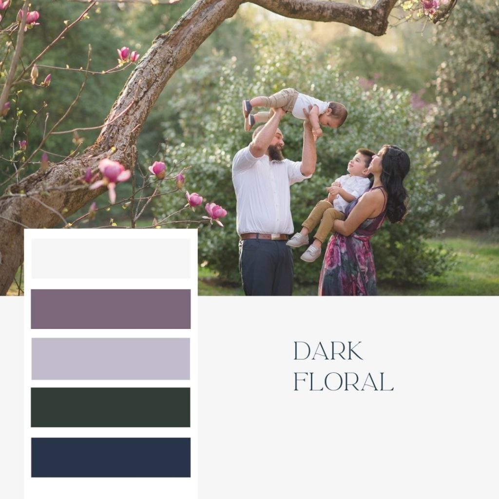
One of the more sophisticated color schemes for family photos, this palette feels elegant with just a touch of drama. Go for bolder jewel tones, like deep purples, magentas, dark greens, and navy shades, but keep it springy by mixing in lighters neutral like white, cream, or even khaki.
Perfect for:
- Complementing flowering trees
- Providing an eye-catching pop of color against a green background
- Helping your images stand out in your home, especially if you have lighter walls
Expert tip: This is the perfect time to showcase a flowy, floral dress for Mom. Just be sure to balance patterns and textures with simpler options for other family members.
Summer Berry
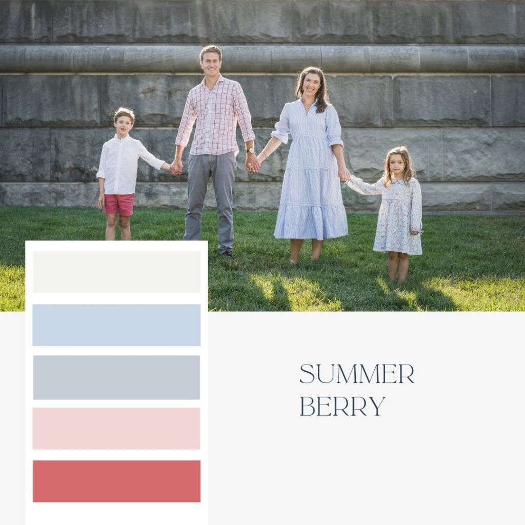
Light-and-bright tones are always a springtime favorite — and it stands to reason. These fun, casual shades invoke “summer farmer’s market” vibes. From rich berry tones to bright pinks and light blues, you can use these colors to create a palette that feels just as fresh.
Perfect for:
- Popping against any neutral background like a stone wall or light-wood barn
- Blending with traditional outdoor scenery like parks, gardens — even the beach
- Creating a light feel that really captures the spirit of the spring season
Expert tip: Don’t go too matchy-matchy with your color picks. You want it to look like you casually put these shades together — not like you picked out the same outfit for your entire family!
Beach Neutrals
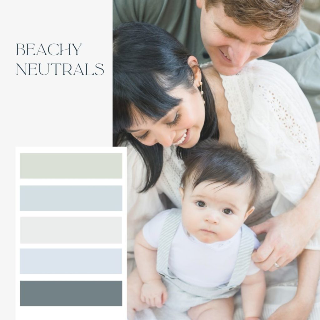
It may not be summer yet, but it’s never too early to take it to the beach! (At least with your color choices.) I love combining light and neutral shades like seafoam greens and pale blue with creams and grays for a serene color palette that blends beautifully with neutral and vibrant backgrounds.
Perfect for:
- Creating timeless, neutral images that will work well with almost any home decor
- Standing out beautifully against darker walls in your home
- Families with darker hair and warmer skin tones
Expert tip: Remember that going too light tends to wash people out when choosing color schemes for your family photos. Instead, opt for a few warmer shades or deeper hues to keep your photos from looking all the same shade.
Take a look at THIS DRESS. We are loving this one and think it would be perfect for a beachy neutral feel!
Cotton Candy
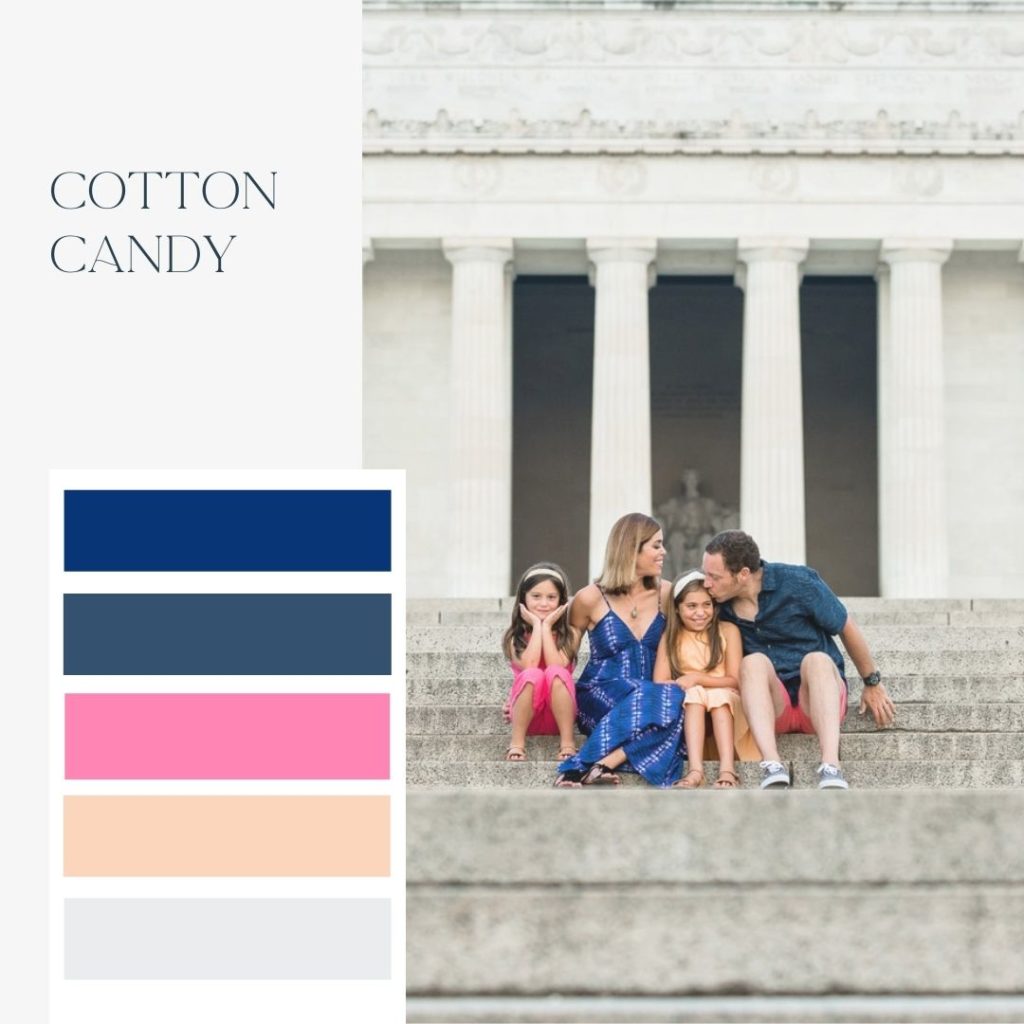
Some shades are just made for the warm-weather months, and this is one of them! A fun and playful color scheme for family photos, this mix of blues, pink, and peach tones is the perfect way to capture the spirit of spring and summer.
Perfect for:
- Fashion-forward families that want to showcase their personality
- Bringing some fun, unexpected color tones into your home
- Families with darker hair and warmer skin tones
Expert tip: These shades really pop against both light and dark backgrounds, so be bold in your setting choices. (You really can’t go wrong!)
American Icon
![Mom, Dad, and two young children posing for family photo in front of the Lincoln Memorial in Washington, DC. American-themed color schemes for family photos with red, white, and blue.]](https://michellelindsayphotography.com/wp-content/uploads/2022/03/6-1024x1024.jpg)
More than just a nod to summertime, an Americana-themed red, white, and blue color scheme for family photos is always a bold choice — and one of my favorites. The stark contrast of the bright colors makes your family the star, no matter what background you choose.
Perfect for:
- Neutral backgrounds like stone, marble, or a sandy beach
- Families that like a bolder vibe to their images
- Casual or more dressed-up looks (reds and dark blues can swing both ways)
Expert tip: These shades can look theme-y if not planned appropriately. Rather than incorporating every shade into your palette, choose 2–3 and don’t over-accessorize.
THIS DRESS would be so precious for a little girl with this color palette!
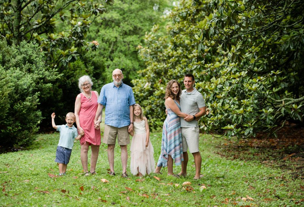
Classic Neutrals
![Mom, Dad, and two young children posing for playful outdoor family photos surrounded by greenery. Classic neutrals color schemes for family photos with gray, black, white, and tan shades.]](https://michellelindsayphotography.com/wp-content/uploads/2022/03/7-1024x1024.jpg)
Sometimes the scenery speaks for itself, so opt for a color scheme that lets the natural landscape shine through. A blend of neutrals in the same tonal range is always a smart choice that will look classic, put-together, and never go out of style.
Perfect for:
- Families that love black and white images
- Creating a neutral palette that will work against any color wall
- Indoor photos or more formal settings
Expert tip: If your family has fairer skin tones, you can still go neutral, but choose shades like tans, ivories, and champagnes to bring more warmth to the overall image.
Whatever color scheme you choose for your family photos, remember to keep it simple. Start with a neutral base and build from there, incorporating some new items (if you feel like shopping) without stressing out or spending too much money on outfits for the whole family.
And most of all, don’t overthink it. While I’m always here to recommend color schemes for spring family photos, you should pick what you really like and what reflects your family’s unique style at the end of the day. Just be yourselves, and that authenticity will shine through!
THIS DRESS would be the perfect off white neutral and is great for someone with or without a bump!
So, are you ready to schedule your session? Let’s connect today to get you on the schedule. And don’t forget to explore our Petite options — perfect for those in-between moments when you don’t need a full photo session.
If you’re planning a newborn session soon, check out some of my favorite newborn photo color palettes here!


Comments +